
A month rebuilding the Research screen, and what it taught me
Sixty-four technologies fitted into a perfectly correct and perfectly unreadable grid. It took a month to work out that the grid was not the problem.
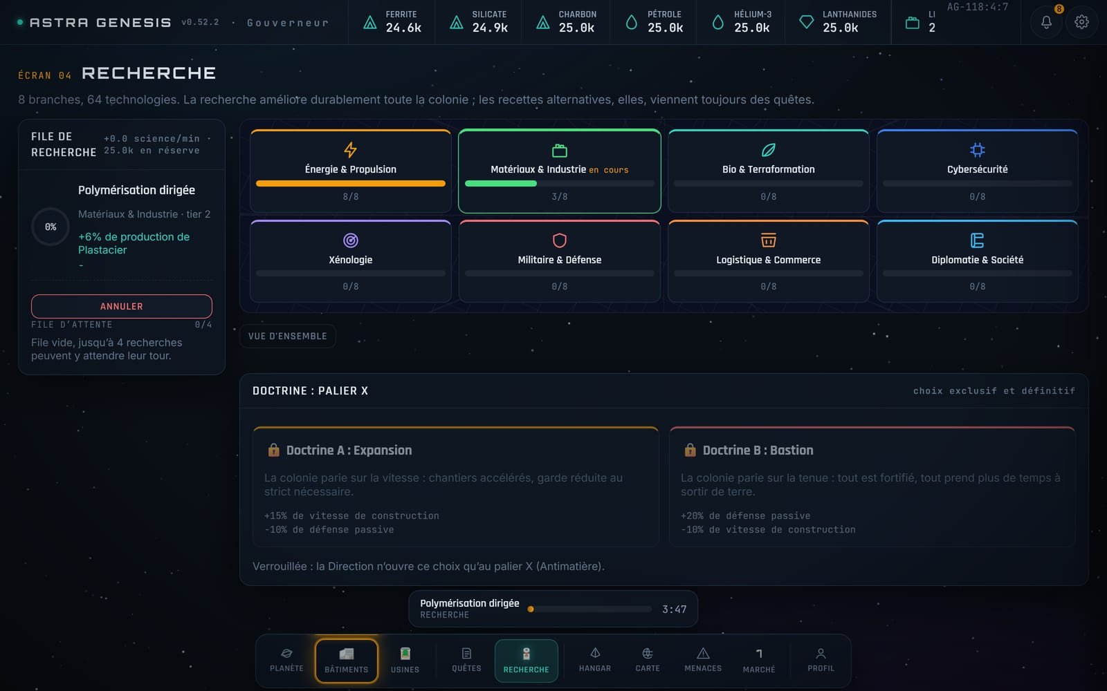
The Research screen had existed for eight months. It worked. All sixty-four technologies were displayed, the prerequisites were right, the queue ran. And nobody, myself included, could decide what to research.
The first diagnosis, which was wrong
My first thought was: it is too dense. Eight branches, eight technologies each, that is a wall. So I tried to declutter. I shrank the cards, added whitespace, moved the descriptions into a tooltip.
It changed nothing. It was prettier and still impossible to decide from.
The real problem
What was missing was not space, it was consequence. A card said "Advanced photovoltaics, cost 400 Data, 12 minutes". Nowhere did it say what that would do to my colony, right now, with my colony.
The difference between the two phrasings:
Advanced photovoltaics, +6% solar panel yield
Advanced photovoltaics, +18 power across your four solar fields, which is enough to run the Plate Press you are missing
The second one requires the engine to know the actual state of the save at the moment of display. That is more work: every technology effect has to be a function evaluable against the current state, not a line of hand-written text. I had to rewrite the effects table for it.
What the rebuild produced
- A sticky queue panel on the left, always visible, answering "what is running right now" without scrolling.
- Eight genuinely colour-coded branches, with the colour reused everywhere else in the game. Colour is not decoration here, it is identity.
- A vertical tree rather than a horizontal one, because a screen is taller than it is wide once the HUD is accounted for.
- The tier X doctrine behind a double confirmation, because three people picked it by accident during testing. A permanent choice deserves to be asked twice.
What I take from it
When a screen is unreadable, the temptation is to simplify it. Nine times out of ten in this project, the real problem was not the amount of information: the piece that lets you decide was missing. Removing is not enough. Often you have to add the right thing, and that costs more.
The screen today shows more text than before. It is far simpler to use.